Do you think we’ll ever look back and remember the time when all our apps and screens turned from Anakin Skywalker to Darth Vader overnight? Us neither, but right now everyone’s heading to the dark side, and we are looking to find out why.
Is Everyone Getting a Dark Mode?
Well, it looks like it. Facebook, Pinterest, Deezer, Gmail, Google Chrome… everyone has gone dark. And finally, WhatsApp is catching up with the rest of the gang. The exact date remains a secret but it should soon hit our phones.
The recent craze started early October when Instagram updated its iPhone app to support the dark mode introduced on iOS13 in September. Since then, every day we hear that an app now has a dark mode. Instagram wasn’t the first social app to jump on the bandwagon. Although it’s certainly the one that surprises me the most. For years, Instagram users have been curating a sleek look adding white borders to their pictures, turning their feeds into real art galleries. I tried it myself. And SHARE did too. And now everything is ruined.

In July 2016, Twitter introduced a ‘night-mode’ on Android. It was harshly criticised for not being dark enough but one month later, the option was available on iOS. YouTube brought a dark theme to its platform in May 2017 to accommodate our late-night binge. Android phones, Microsoft Outlook, Gmail and more started to offer a dark themed version of their interface. But if I’m honest it was only in September 2018 with the release of macOS Mojave that I really paid attention to it. Since the update, it feels like everyone is making the switch. But why? What’s so great about this light-on-dark colour scheme?
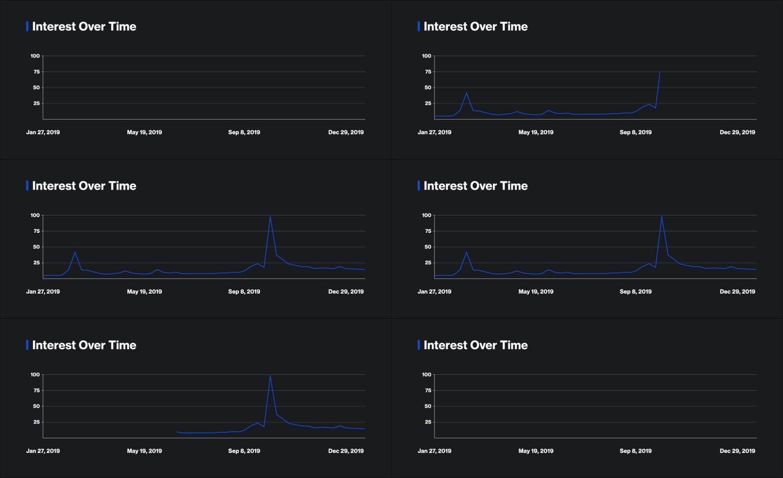
 Dark Mode, Interest Over Time, Google Trends
Where It All Began
The idea of a ‘dark mode’ is not a brand new concept imagined by Apple. Developers have been writing on dark-themed code editors for a long time. In the article ‘Why Developers Prefer Dark Coding Themes?’ on Medium, Tigran Bayburtsyan says: “It is counted that over 70% of software engineers coding on a Dark Theme IDE’s, if you take a look on popular coding environment theme downloads you will find always that the top 10 themes are dark.” I asked SHARE’s very own Data Scientists what they think about it. Mike has been using a solarized dark theme so a) it doesn’t hurt the eyes when coding for hours on end and b) coding fonts are serif so it’s easier to tell similar symbols apart like O and 0. He finds this is easier to do with light text on a dark background. Mitch, on the other hand, isn’t changing his habits of defying the norm as he is using a dark theme on everything except coding!
Should You Swipe Your Devices to Dark Mode?
I’m not telling you anything new here, we spend a lot of time on our mobiles. ‘3 hrs 23 minutes is the average amount of time Brits spend looking at their phones every day’ according to a national poll by Code Computerlove. As a Social Media Marketer, I’m afraid to look at my daily screen time for fear of throwing my phone out the window. Also, we are talking more and more about the harmful effects of blue light exposure (risk of cancer, insomnia, increases in myopia/nearsightedness). Being surrounded by screens all day is getting really scary. I mean, I’m already wearing glasses.
Dark Mode is probably one of the biggest changes in terms of user interfaces. Every single app, device and website will need to update their offering if they want to stay relevant. Dark Mode claims to help concentration by preventing eye strain, especially in low-light environments. It should lengthen the battery life of our devices since our phones are using less power. And overall the use of dark tones is more aesthetically pleasing.
But is the dark mode the solution? In my opinion, Dark Mode appears like the Prince Charming on a white horse, well dark horse, I guess. At SHARE, our work is backed up by data and I’m sceptical. Before I give it a try myself, I’m waiting for tangible proof that it’s worth the hype. What do you think of the Dark Mode? Talk to us!
Amandine Bula
