As our lives become more and more data-driven, it’s no surprise that even our music choices can be analysed using data science. Music brings about shared connection, has the power to enhance mood, and can create a sense of community. So, with Glastonbury soon approaching, we decided to use data science to analyse our office Spotify account and find out what kind of music we like and see if we could use these insights to plan a festival (SHAREfest 2023) off the back of this! We retrieved our Spotify data using Spotify’s API, with all subsequent analyses and visualisations performed and created solely in R.
Visualising our Spotify behaviour to uncover our favourite artists
Firstly, we can look at our most popular artists played through our account. Spotify determines our most popular artists through a proprietary algorithm known as “calculated affinity” which considers our listening behaviour while not in incognito mode. So, whilst not necessarily being the “most played songs” it is a good proxy based on our Spotify behaviour.
We can create a chart to display our top 10 artists, and to make things more interesting, we can use R to turn it into a wonky music equaliser (we are a creative agency after all)! Spotify provides us with values for their own internal scoring of Popularity, which allows us to see if our most popular artists are also popular among Spotify’s overall audience. This visualisation not only gives us insight into our top artists but also helps us understand how they perform in the larger music market.

In this plot we can see our top 10 artists (ranked from 1 to 10 going down the plot). The distance on the x axis represents Spotify’s internal Popularity score (ranging from 0 – 100)- we can see whilst we have some popular artists appearing (such as The Beatles), we also have some more mid-popular artists appearing in our top 10 artists too- showing we strike the perfect balance between hipster and mainstream.
Discovering the musical patterns of our favourite songs through Spotify’s audio features
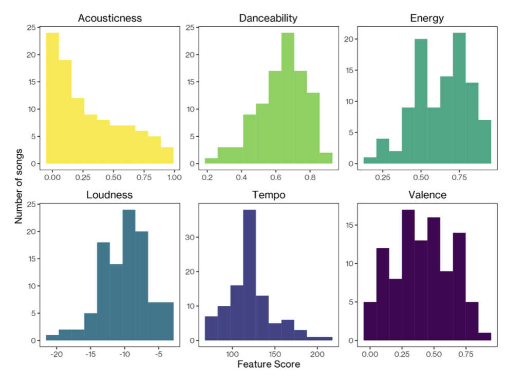
Similarly to above, we can collect the top 100 songs from the office over the past six months. Beyond just simple song metadata, Spotify provides us with cool audio features of songs. We will be focusing on six key features:
- Acousticness: How confident Spotify is whether the track is acoustic (scored 0 – 1). Can we save money on big powerful amps by playing acoustic tracks?
- Danceability: How ‘danceable’ a track is (scored 0 – 1). Is our festival going to be a chance to bop away to the music?
- Energy: A perceptual measure of intensity and activity (scored 0 – 1). We want to be aware if SHAREfest is going to be high-energy or a more chilled event.
- Loudness: The overall loudness (averaged across the track) of the track in decibels (score typically ranges between -60 and 0db).
- Tempo: The estimated tempo in beats per minute. Will our audience be getting a free workout with the music?
- Valence: The musical positiveness conveyed by a track, that is higher scores sound more positive with lower scores sounding more negative (scored 0 – 1).
These audio features enable us to identify patterns in our song choices, and we can visualise these using charts called histograms. These show how many times a range of values appears in a dataset- the higher the bar the more songs we have that contain that feature score! For example, below we see the largest bar for ‘Acousticness” is at ~0.0 with a decrease in bar size as acousticness values get larger- showing that we tend to listen to fewer acoustic tracks!
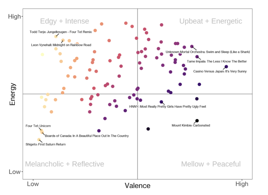
Two of these features, Energy and Valence, nicely work together to describe the key emotional makeup of songs. There are some great examples of these visualisations online, so we thought we’d give it a go ourselves. The results below show clear groups of songs that fall into each category. Evidently our office is not the place for slow chilled songs and rather a hub of energy and activity, as evidenced through our music choice.
Designing SHAREfest: Creating unique stages based on artist similarity
Now that we’ve decided on the artists and their songs, let’s create unique stages to ensure that similar artists perform in the same areas. To accomplish this, we’ll use the music features we’ve previously explored to identify songs that are similar to one another. While we’ve discovered that focusing on just two features (Valence and Energy) can lead to groups of similar songs, it becomes more challenging as we add more features. To tackle this, we can use two techniques called ‘principal component analysis’ and ‘k-means clustering’ to group together songs that have similar Spotify feature scores. This analysis will form clusters of closely related songs, which will be the foundation for our SHAREfest stages.
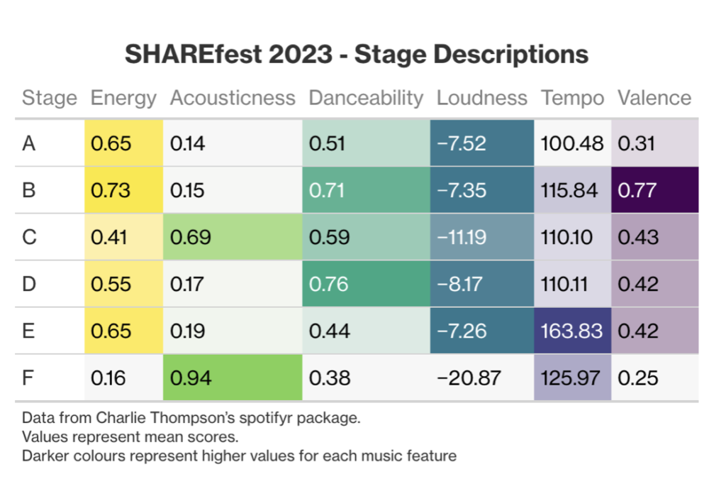
To do this we first need to select some songs from our SHARE artists. Spotify provides an option to obtain the most popular songs per artists. We do this assuming these songs are a good representation of each artist’s musical style (and what they would perform at a festival). From there, our analysis showed that we need six stages (Glastonbury we’re coming for you) due to our songs clustering into six nice groupings. These groupings (stages) are summarised in the below table where we can see the key features that differentiate different stages. For example, Stage F might have artists playing ambient or classical style songs.
Next, we’ll find out which artists appear most frequently in each Stage (cluster)- these are our headliners! We can visualise all the analysed songs for our top artists using the clustering analysis we previously performed. Each dot in the plot represents a song, and the colour indicates the stage it would best suit. We can use this plot to identify which stages are most similar to each other and plan accordingly to ensure festival-goers can easily move between these stages.

However, to avoid the possibility of an artist appearing at different stages due to playing a variety of music, we take the average song position for each artist. This allows us to identify our headliners – the artists most associated with each stage.

Using this information, we can announce our headliners for each stage along with their support acts. By collating the headliners with the next three most commonly-clustered artists for each group, we can ensure that festival goers have a variety of artists to enjoy while also catering to their musical preferences.

This approach not only allows us to successfully plan a music festival but also reveals interesting insights about the relationships between artists and their music features. For example, grouping Frank Sinatra and Tony Bennett together makes sense based on our analysis, but grouping The xx with these artists may not align with our prior judgement.
This blog post may only be a glimpse into our world of data science, but we can see how such analyses can provide a unique lens through which we can gain valuable insights into the music industry.