Whilst the 2020 Olympics are well underway in Tokyo, we had a peek at ‘120 years of Olympic history: athletes and results’, a data set put together by the Kaggle user ‘rgriffin’.
We used the statistical programming language R and ggplot2 – a library built specifically for data visualisation and some custom SHARE themes to create the visualisations. We also used the Tidyverse for various data wrangling/manipulation challenges, like grouping variables, partitioning data and calculating summary statistics!
We filtered for the Summer Games and investigated a few choice areas, starting with top countries by team medals and number of individual medallists over time, followed by a focus on GBR, the distributions of height and weight by sport, the most dominated sports by individual countries and finally numbers of male / female participants over time.
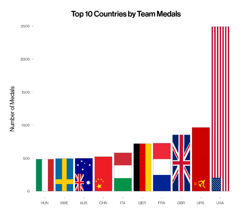
1. Medallists by country
If we take a look at overall team medals, where the country’s 3-letter code is on the x axis and the number of medals won is on the y axis, we see that the USA are way out on top, followed by the Soviet Union (URS) and GBR.
To calculate this we had to group by country & sex, create a ‘unique event’ column by combining events, medals and years, and then finally remove the duplicates entries, that way any given country would only receive one medal in a team event like in the 4x100m relay.
What did we learn?
Much of the top 10 is as we would expect; affluent nations with rich sporting histories. It is somewhat surprising that China are so far down the all-time table, but having dug into the data, we saw that China only won their first medal in 1984.
2. How are the Top Countries’ Medals Broken Down?
We recreated a similar chart, but this time we broke the medals down to see each country’s split of gold, silver and bronze. We added a separate colour for each medal, and put the bars side by side, rather than stacked on top of one another.

What did we learn?
We see that the USA are proportionately the best at converting medals into golds, whereas countries like GBR and France tend to win fewer golds than silver or bronze.
3. Individual Medallists over Time
Putting a different spin on things, we counted the number of individual medallists (so, a 4x100m relay team counts as four individual medals) and charted it over time, to see how the individual picture compares to the team picture.
We put the year along the x axis, and the cumulative total of medals on the y axis:

What did we learn?
The Soviet Union stopped competing in 1986, so it’s quite remarkable that they remain second on the table! Australia have also been performing incredibly well given how far they were behind countries like Germany and GBR going into the 1950s. Great Australian swimmers like Stephanie Rice and Ian Thorpe come to mind.
4. GBR Breakdown
We wanted to look at which sports our own country has done well in historically. We made three different charts to try and gauge our performance. It’s quite a complicated question, because what’s more important – overall medals, rank of medals won vs rank of participants sent, or participants per medal?
The lollipop chart below shows GBR’s top 15 sports by medal count.
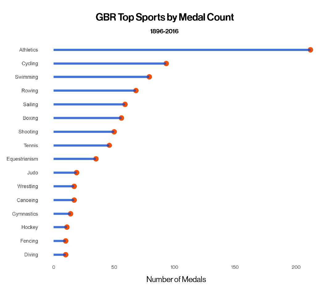
What did we learn?
Athletics, Cycling and Swimming are the top three medal earners for GBR. There are more events in these three sports than any other, so we would expect most countries to have won the highest share of their medals in these three sports. But does that mean GBR are best at Athletics and not so good at Diving, or do we have more athletes competing in more events and therefore a better chance of winning?
5. Participants vs Medals Won
We have seen that GBR have won the highest share of their medals in Athletics, but looking at the following dumbbell chart, we see that they have also sent the most athletes to Athletics.
We counted the number of participants and medals won by GBR, gave each sport a rank for both and compared participant rank vs medals rank. The blue dot shows the participant rank, a red or green dot shows the medal rank – where green is ‘overperforming’, red is ‘underperforming’ and a lonesome blue dot signifies the sport is ranked equally for participants sent and medals won, or no medals have been won.

What did we learn?
GBR seem to underperform quite dramatically in Gymnastics, whilst overperforming in Cycling, Sailing, Boxing & Taekwondo amongst others.
6. Participants per Medal
Another way of comparing Great Britain’s performance between sports, would be to count how many participants have been sent to each sport, and divide by the number of medals won, to show how many participants we send per medal won.

What did we learn?
We can see that per medal won, GBR sends the fewest number of participants to Taekwondo, suggesting that we really do over perform in the sport. We found Tennis’s inclusion in second place very surprising, but in the early 20th century GBR were very dominant in Tennis.
On a less positive note, it does seem to be the case that GBR underachieves in Gymnastics, whether comparing ranks or counting participants per medal.
7. Which sports are most dominated by which country?
In the next chart, we have the proportion of gold medals by sport on the x axis, sport on the y axis, and the bars are coloured according to the country which is most dominant in that sport.
This chart takes a few steps: first we filter for sports in which more than 10 golds have been distributed, then we group by sex, sport, and year. Then count the total number of gold medals won for each sport, group by country and count the country’s number of golds won. Then divide each country’s golds by total golds to see the proportion, arrange the proportion in descending order and plot/colour accordingly, voila!
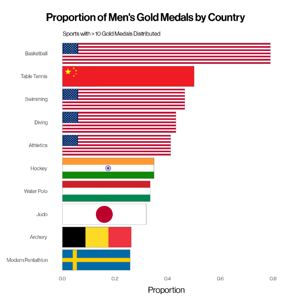
What did we learn?
The story here is that the USA is by far the most dominant country when it comes to any individual sport, taking ~80% of the Men’s Basketball gold medals. The next closest, as a proportion of gold medals is China, with 50% of Table Tennis golds in the Men’s Games. We see some interesting country specialities – India in Hockey & Belgium in Archery.
We did the same for the women’s sports in the next chart.
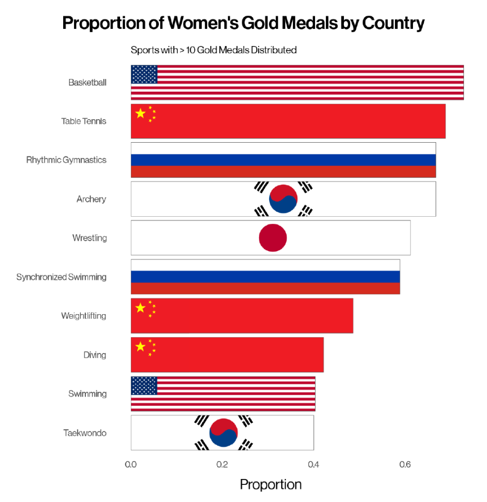
What did we learn?
In contrast to the men’s Games, China is dominant in the highest number of women’s events, matching the men in Table Tennis and reigning supreme in Weightlifting and Diving. Similar to their male counterparts, US women dominate Basketball, having won 8/11 golds since its inception as an Olympic event in 1976.
Interestingly, only 5 countries figure in the chart – compared to 7 in the men’s chart; a smaller number of countries are dominating more sports. There are also more events which have been won more than 50% of the time by the same country, suggesting the dominant countries are more dominant in the women’s than the men’s Games.
We made a similar graphic for individual events, but we figured we had given enough props to the USA already – they dominated both charts. So we moved onto heights and weights…
8. Male + Female Heights & Weights
How does height and weight affect participation in the Olympics? We created violin plots for four of the biggest Olympic sports; Athletics, Cycling, Gymnastics and Swimming. Violin plots are like box plots, except they give a better visual representation of a variable’s distribution. The highest number of data points are found where the violin is widest.
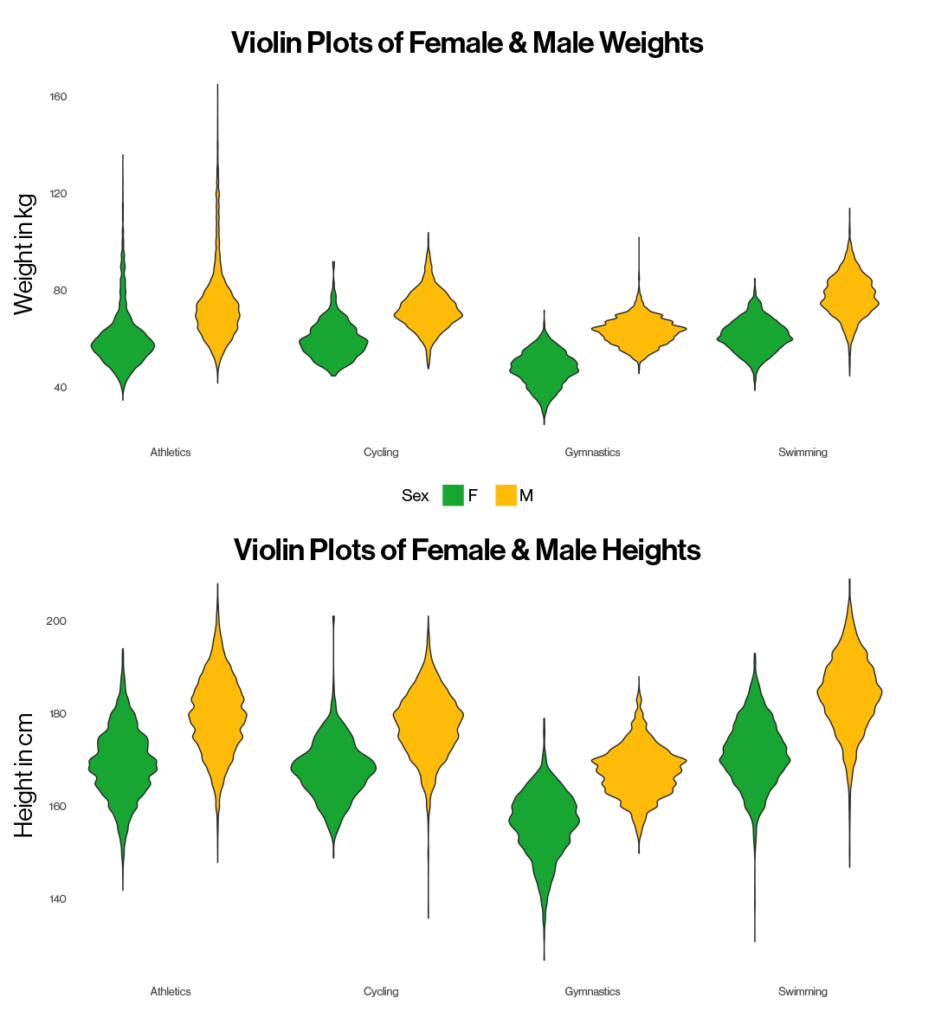
What did we learn?
As we may expect, generally men weigh more and are taller than their female counterparts. We see the most variance in Athletics, where there are a number of outliers for height in both directions – and also heavy participants – which makes sense given the range of events within Athletics i.e. height is an advantage in the High Jump, but not so much in the Hammer Throw or long-distance running!
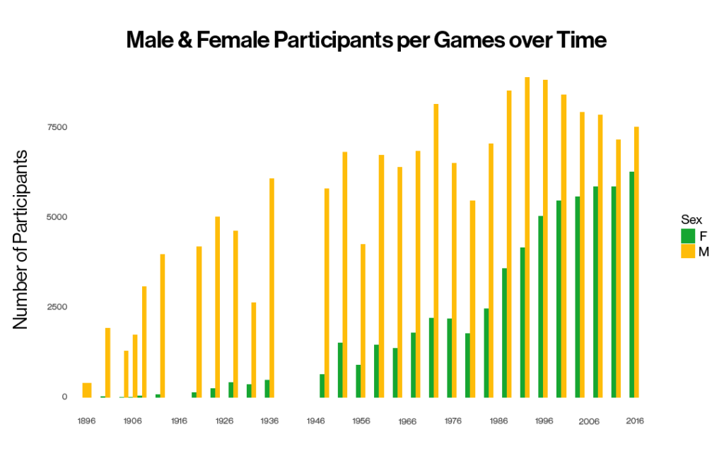
9. The Sex Gap
Given that Women were not permitted to compete in the 1896 Olympics, we wanted to research the sex gap in participation over time to see how much progress has been made. We grouped by sex & year, then plotted time along the x axis (in 10 year breaks for visual ease) with number of participants on the y axis.
What did we learn?
It’s great to see the numbers have been steadily growing since and the sex gap of participation has been significantly reduced.
According to the IOC quota allocation, almost 49 per cent of the athletes participating this year in Tokyo are women. This will be the first gender-balanced Games in history.
We had a blast exploring this data set, and there are so many more questions to be answered. For any more information or to share any thoughts on the above, please email talktous@sharecreative.com.